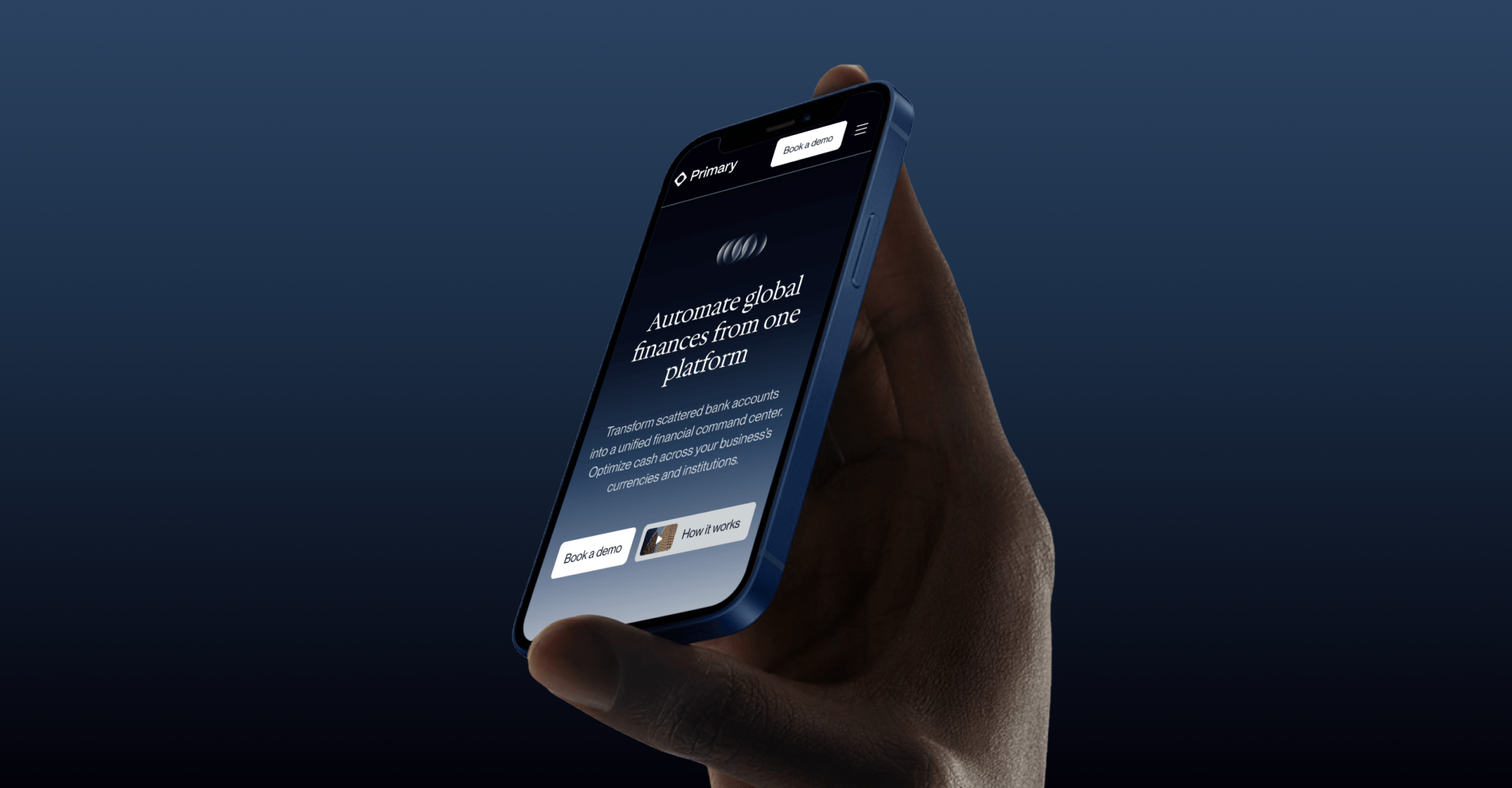
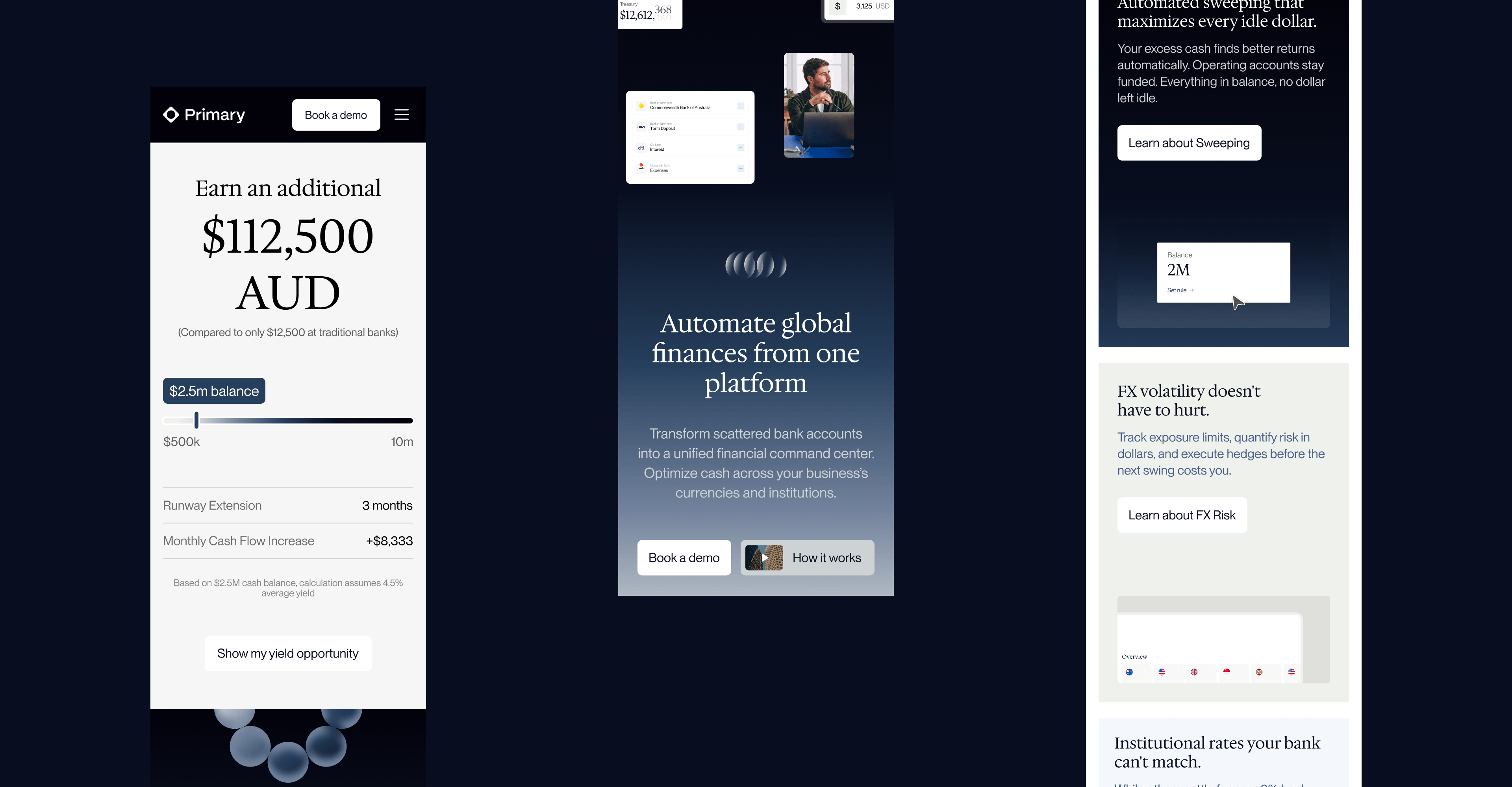
Primary was moving upmarket and needed an updated brand identity and marketing website to match.
Role
Brand & UX/UI Designer
Studio
Lowercase
primary.tech
Originally built for early-stage startups, Primary was repositioned to target established enterprise finance teams who managed serious cash across multiple entities and currencies.
Blue, made serious
Maintaining their previous brand colour but evolved to reflect their new positioning.
Layers as a brand device
Primary sits above your banks, not instead of them. Overlapping translucent surfaces make that proposition visible without a word of copy.
Coins without the cliché
Elevated 3D circles as visual device that provided weight and depth.